hhtp://gwilymsimcock.com
This article could also include information of a jazz group that the particular musician plays in such as a miles davis style classical jazz big band. This genre of music, classical jazz, is mostly instrumental with occasional songs for vocalists such as Cole Porter's "Anything Goes", and Gershwin's "I got rhythm".
Information could also be included on how the music of their album was recorded, with details of production and mixing/production techniques. This would attract a further audience of music technology students and those with an interest in production of particularly classical and jazz music. Sound on Sound magazine is a muic production magazine, which covers all genres. However, there is little about recording classical music and mixing this, there is more information on popular music and equipment and new technology. I am going to try and incorporate a little bit of recording information in my magazine, for classical and jazz musicians who are interested in producing their own music, or working with classical musicians in a recording studio environment.
Details of what the musician plans to achieve in the future could also be included, so that readers can see their goals, this will help music students to set their own goals.
I am going to use a writing style that is quite informal, as my target audience is roughly about 16-26. However, I want to include information that will be useful to students work as well as providing something that is fun to read. Also by doing this the magazine will appeal to non musicians who like classical music and classical jazz.
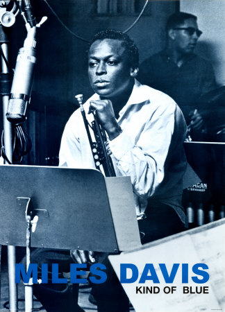
For this article the photographs should be relaxed looking, similar to the miles davis photograph posted earlier, with musicians posing with their instruments as well as portrait style shots. Also action shots of the musicians playing their instruments could be used. Also musicians with small instruments such as trumpets, could be photographed holding their instruments, which could be cut out and placed amongst the text. This is a common feature found in all magazines, not just music magazines. I would like to use very colourful photographs, with a main focal point and a blurred background as I think this is one of the most effective layouts for an image. I would like my photographs to look relaxed, but I will stage my photographs to make sure that they look perfect.
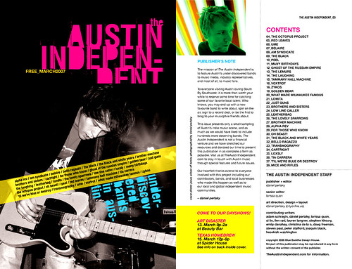
For my contents page, I am going to use a variety of images of many different musicians and instruments. For these I shall stage many photographs and take photographs from different angles to achieve the perfect look. Photographers have taken interesting images of instruments, and I would also like to do this. I have access to a lot of instruments as I play the french horn, trumpet, cornet, and the piano. Also many of my friends are musicians so I will be able to take photographs of a wide range of instruments, then I can choose the best one.
For my front cover, I would like to use a shot of a musician in a medium close up, similar to the one used in my preliminary task, as I like this look and it is used on the cover of Classic Fm magazine, and always works well, and creates a glamorous look. I will then place many secondary images around this. From my preliminary task, I have learnt that the lighting for the photographs makes a huge difference, as my main photograph was a little orange looking. However, I felt that this was a good photograph to use. For my music magazine front cover, I would like to use a similar photograph to this, which relates to the main article, but a photograph which has much more of a glamorous, modern and individual look. This will involve the musician's appearance and also some interesting image editing.
I like the look of photographs that use a colour wash, an example of this is on one of the contents pages that I have reviewed. I think that this is an original look and creates interest in the image, rather than being all natural colours. However, I do not think that this would work for my front cover image, but may look very good in the contents page and/or the double page spread.