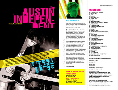
 This contents page taken from "The Austin Independent" is a very modern and unique layout. The image of a guitarist has overlapping text in bright colours, layered on and positioned at different angles. This is a very effective use of design. I especially like the title as it is in a bright colour, but the font is unique with filled in letters which are slightly missed off on the last line. I also like the blue text underneath the diagonal yellow text box, which is aligned with the text box as this adds a new colour and also a new angle. The main contents page uses a plain white background, which is not as effective as the black with colours as the image page was. However, the image of the publisher has been edited so that the man looks green and the background is stripes which give a feeling of dimension to the image. I particularly like this image as it is interesting and unique. The rest of the contents page is plain black text on a white background. I find this very uninteresting, and I feel that it spoils the overall look of the page. I think that if the black background had been used for this part with white and coloured text would have looked much better.
I would like to use some of the ideas of layering shown in this example, mainly from the part of the page which uses an image and a black background. I would also like to experiment with the colours of my images, to make them as interesting as possible, like the images on this layout.
No comments:
Post a Comment