Tuesday 21 April 2009

Evaluation

AS MEDIA STUDIES 

EVALUATIONS: FOUNDATION PORTFOLIO


The genre of my music magazine is classical. Conventions of this genre which I have included are the musical symbols such as the treble clef, the classical instruments (horn and piano). Also the elements mentioned in my magazine article are related to classical music for example orchestras, music schools and composers. It was vital to use these elements to ensure that my product Interests the target audience of music students and teenage classical music lovers. To make my magazine different I took on a more modern approach, using modern fonts and a modern layout. These modern fonts produce connotations of an urban, teenage magazine. I needed to do this to make sure that my magazine appealed to my target audience. My innovations were likely to prove successful as I am a music student myself, and so I know what appeals to the target audience. I received lots of positive feedback from my audience testing. One person said that it was “A contemporary approach to an old industry”, another said that “The bold colours and photograph make the magazine very striking and something that I would like to read.” I also tried to make my article more fun to read than other classical music magazines, as well as being informative, this worked, as 100% of my audience found it interesting. My audience also said that the contents page was “well arranged”, and  “it shows that the magazine is really well organized”


My magazine represents classical music, but differs from the traditional representation, of an old, dull and boring industry for older people who are considered to be very intelligent, out-dated and stuck-up, as it is a more modern approach and is new and exciting. The social group represented in my magazine is teenagers and young music stars. I feel that my magazine paints a positive picture of this group, and shows that they are determined and talented individuals. This differs to the typical media representation of teenagers as they are usually represented as criminals and anti social people who are not welcome in society. However, in my article there is a reference to band members who deserted their friend once he left the band. This creates a negative picture of teenagers, but this is overpowered by the positive representations of the main star, Jamie. To create this positive representation, the model wore a suit but without a tie to create a polished but young and slightly edgy look, the model has a unique look, which is appealing, and from my audience testing I have found that people find this look perfect for the magazine and very appealing. I photographed Jamie in a unique way, and I used a variety of shots to reflect his age and personality. My audience testing was extremely positive for my images, with comments such as “I really like the images, Reflections in the horn make the picture look interesting and holding the horn shows off his passion for the instrument”. Once again 100% of my audience really liked my images, and said that they were the most appealing element of the magazine.


I think that an organization such as MusicMags would publish my magazine as this company publishes modern music magazines in every genre including classical. I think my music magazine would be appealing as it presents classical music to  a new audience and is different from other magazines. The publisher would think that my magazine would create a profit as it is unique and the audience that it targets exists, and there are millions of determined classical music students. I also feel that they would be attracted to my magazine as it is very positive and is a completely new approach to classical music. This company produces many music magazines including Sound on Sound, and magazines aimed at musicians such as International Musician. My magazine is aimed at classical and jazz young musicians and music students, which were my test audience who provided 100% positive feedback,so I feel that this company would benefit from my magazine, as their magazines are for older musicians who are not students. From my audience testing, I found that two thirds of the audience would purchase my magazine if it was available to buy, with the other third not purchasing it because they did not have the money. I tested 3 people, and I think that even from this small amount, that my magazine would be popular and would make a huge profit for the media institution. 


The name of my magazine, "The Score", immediately suggests classical music, One person said that there was an "obvious consolation with music, and a suggestion of keeping on track of what's going on, knowing the score". From this I can tell that the title did attract the audience. The front cover image, of Jamie holding the horn in the air, worked well, with 100% of the audience awarding praise. The use of story lines on the front cover also attracted my audience, combined with the modern font and bright colours was praised, "Different fonts and colours have made the words stand out on the page, Also making the writing bold makes it easier to read". My contents page was laid out in a simplistic way to make it easy to read, which was exactly what it did. “From the contents it shows that the magazine is really well organised". Again praise was awarded for the fonts and bright colours, and the image. The double page spread was well liked by my audience: 100% found it interesting, 100% loved the images, especially the image of a reflection in the horn, and the image of Jamie holding the horn close to himself. The layout of the article was also successful, which I was pleased about as I wasn't sure if there was too much text or not but the layout was "easy on the eyes, aesthetically pleasing text, imagery and graphics." The ideologies of celebrity that my pieces use are glamorous, but edgy and very current and appealing. The audience has responded well to this, and I feel that young music students would be inspired by this, and look up to people like Jamie.


I used the internet to research my product, and to create a record of my work on my blog using blogger.com. This has been very useful as I have been able to find lots of information to use with the magazines that I purchased. This formed good research which helped me to make the final decisions about my work. I learnt how to take effective photographs, and how to edit them to make them look even better in Adobe Photoshop using crop tools, hue and saturation editing, magic wand tool and the pen tool to name just a few. For example, I cropped the image of Jamie shown below using the crop tool, I then twisted the image to give a more interesting, canted angle effect. I also edited the colours slightly by adding a slight curve to the image. In addition, I learnt how to combine the images with text and other graphics in Adobe In Design and using tools such as rectangle tools, cropping tool, and text tools to achieve a professional look. This software was very difficult to use at first, but once I had produced my preliminary task, I was quite familiar with the software, which allowed me to be able to create the professional look of my magazine. I found some limitations with musical symbols, which prevented my original idea from working. However, I feel that the way my logo is was beneficial to the overall look of the magazine, and I wouldn't change it.  To gain audience feedback, I created a questionnaire which I then printed out and handed to 3 music students to gain feedback. 


This is the image which I edited using the crop tools and by twisting the image and editing the colours.


Since my preliminary task, my photography skills have improved dramatically, I took lots of photographs for my preliminary task so that I could practice using different shots, which was very worthwhile in helping me to produce my final photographs. The preliminary task photographs were taken indoors, and the main photographs were taken outside, I feel that this has made my photographs look more professional as the lighting took away the 'orange face look'. I also feel that the design of my magazine has improved since the preliminary task, and my text and fonts are better, and the layout as a whole is much more appealing and sophisticated. The colours in my magazine are much more striking and attractive than my preliminary task, and this has been praised through my audience testing. Looking back at my preliminary task, I can see that my skills have vastly improved, and I have learnt a lot during the time spent producing my coursework.


In conclusion, I am very pleased with my music magazine. I have achieved all that I wanted to and have attracted the audience, and produced an interesting and unique magazine. The layout that I used worked very well and the images look very polished. My audience testing confirmed that my magazine is a professional production, that would be successful if it were to be published.


words: 1529


Monday 16 March 2009

Completed project!

These are the images of my finished pages from my magazine. Overall, I am very pleased with the results and I think that my magazine, if produced would be successful. I think that the colour scheme chosen was appropriate and looks eye catching and modern but still sophisticated. I wanted a more informative look for my magazine as opposed to the informal look of magazines such as NME. I think by my use of layout and style I have achieved this. I am very pleased with the photographs used in my magazine. They look very professional and are unique and different to the images found in existing classical music magazines such as BBC Music Magazine. I feel that the target audience, teenage classical musicians, would be attracted to my magazine, as it is based around a musician of the same age, and is also modern looking at the same time as being traditional. I have been able to satisfy this target audience, as I am a teenage classical musician, and so I know what this audience would read and like.

I think that the font used for my magazine works very well. It is edgy and unique and is not traditional. Young people are more familiar with these more modern, urban fonts, and so this will help in attracting the target audience. 

Thursday 5 February 2009

Mock up of main article

This is a mock up of my main article. The layout is quite simple, the images used will be a variety of action shots and staged portraits. I would like the photographs to be of the musician with their instruments rather than just plain portraits. I would like the text to be layed out in columns, and be of a quite informal but informative language. 

Mock up of my contents page

This is a mock up of what my contents page might look like. As with the front cover musical symbols are used in the title "In this issue". This layout requires many images which are overlapped with each other. However this could look a bit too crowded when complete but hopefully this idea will work. I think that amount of text used will have to be reduced, as there is too much text for the page. However, I want the magazine to look full of articles and information, as students(target audience) will not have very much money, and so making the magazine good value for money is essential. As with the front cover, interesting fonts and bright colours will ned to be used to create an eye catching and unique look and appeal to the target audience.

Mock up of front cover

Opposite is a scanned image of a mock up front cover for my music magazine. The title "The Score" features many musical symbols to show that this is a music magazine, and also to appeal to the target audience, as non musicians will not understand some of these symbols, but this may not be possible when using computer graphics. The main image will be of a person but will be striking and colourful. I think that some of the text and secondary images may not be needed, depending on how 'busy' the main image is. However I think that this front cover will be appealing and striking once colour is applied. I would like to use bright colours that will stand out and make the magazine appeal to the target audience. I have chosen to use a quotation or title from the main article on the cover to show what the main feature of the magazine will be and to attract attention. I will take all of the images planned for this font cover, but depending on how much space the main image will take up, I may not use all of them in the end.

Analysis of a magazine article 5


This double page spread is taken from the American magazine "Hip Hop weekly", based on the music of hip hop this magazine has been expanded to cover the whole hip hop community. This article is mainly text but the language is quite informal. However, this is quite an informative article. The main image is of the artist, as is the secondary image. These images are not particularly unique and striking but serve their purpose at presenting the artist in two different ways, a staged portrait and an action shot of him working in the lab. I like the highlighted quotation from the artist at the top of the second page. This highlighting of a quotation is used regularly in music magazines, and is effective and depending on the fonts and colours look unique and interesting. The band across the top of the pages runs throughout the magazine with a different heading for each section. There is a lot of text in this article, and I feel that this could be reduced to make it more appealing to the reader. Also the images could be more interesting and the overall layout of the article could be improved to break up the text. Overall I think that this is a good layout for a magazine article, but would be better with less text and more interesting images. 

Analysis of a magazine article 4


This is a double page spread taken from Classic Fm magazine. This article is a review of "disc of the month" but also includes a short interview and a main article with information about the music on the cd in addition to the performers. The main image of this article is of opera stars with puppets from the opera production of Dido and Aeneas. The overall layout of this article is quite effective but is slighlty dated, and is not as striking as the NME layouts for example. The secondary image is of Sarah Connolly, the main singer in the opera. This action shot is not very appealing and looks rather strange. It also quite uninteresting. I like the logo for disc of the month which is placed onto the main article, and this adds a new shape to the article, a circle. The language used in this article is about the same sort of style that I will be using for my magazine. However, my magazine will have a more interesting layout and will be more informal in places. 

Analysis of a magazine article 3

These two images are from a double page spread taken from NME magazine. These two pages are mainly black and white, which fits in with the overall newspaper look of this magazine. I like the layout of the main article in columns with a quote highlighted by swapping around the text colour and the box colour. This is also in a larger font than the main article. The title is spread across the two pages and the top line of the title is rotated and placed at an angle. This adds further interest to this layout. The main image, once again is used for the background of the page. The image is not that exciting but the bars used in the image are unique and link in with the title of "How to escape". The secondary image is an action shot of the musician with a guitar at a concert. This image is in colour and although the image is quite dark, the lighting used is coloured and so adds interest to the image. Overall I think that this is an effective and unique layout that would work in most music magazines. However the language, as mentioned previously in the last post is too informal for my audience.


Tuesday 3 February 2009

Analysis of a magazine article 2

This article, from the weekly music magazine NME, is only a single page instead of a double page spread. However the layout is interesting and the images are unique. The main image has been used as the main background of the page. The text has then been placed in a white box, with the title in a larger font and the name of the band is highlighted in a pink box below the title. The main part of this page is the main image, which is an action shot of one of the band members, this has a more striking effect than the other image, which is more of a portrait. This secondary image is boring and is not imaginative. However the overall layout of this article is eye catching and unique. As this magazine has a newspaper look, the bold black text on a white background fits in with this image. The language used in this article is much more informal than that of Sound On Sound. This is due to the target audience- the target audience for NME is teenagers and young adults, who are not necessarily musicians themselves. Although my magazine has the same target audience for age, my magazine is aimed at musicians and music students, and so will have to be quite informal but also technical and precise. I will have to use elements of both writing styles in my article.

Main Article analysis 1

This is a scanned image of one of the articles in January 2009's Sound on Sound magazine. The layout of this article is more like a text book than a magazine. This magazine is a music production magazine, which includes lots of specialist and technical information, rather than a magazine which is more 'easy reading'. The images in this article are of music equipment, and are very uninteresting and are not very appealing to the audience. However, this magazine's audience will find this interesting as they will be interested in this equipment. This article is mainly text, and so is not very visual. The fonts used are standard and plain, like you would find in a manual or text book. However, I like the small title in the rounded rectangle in the top corner. This appears on almost every page, at the start of each new article. This is the magazine's way of categorising articles. I think that this is an effective way of grouping articles so that when flicking through the magazine, you can see exactly where the articles you are interested in such as techniques are in the magazine. For the target audience, this magazine is very successful in providing interesting reading and layout. Music Producers or Music technologists will find this magazine useful and informative. The language of the article is quite formal with lots of technical information, and so readers who are not very interested in this area would find it difficult to understand. This magazine uses more screenshots than photographs as images are used to demonstrate the techniques in the article, not for visual effect. However I like how the main image looks as if a spotlight has been used on the equipment. Although this is nothing new, it still looks effective. Although this magazine is suitable for the audience, my magazine is for a different audience and so I will have to create a much more interesting layout that looks more like an 'easy to read' magazine, even though it will be quite technical.

Friday 30 January 2009

Ideas for the double page spread and image ideas for all pages

An article about an upcoming jazz musician. This could be of a trumpeter, pianist, saxophonist, double bass player, drummer, who plays in a classical jazz style such as Miles Davis or Duke Ellington. This could include information about a debut album, with a short review on one or more of the tracks. The article could also include information about the musician's technique such as approach to improvisation, music that they have composed such as jazz/classical fusion pieces. A good example of a musician in this category is Gwylim Simcock, who is a pianist and composer, who was taught by the same french horn tutor as myself. Gwilym is featured on BBC radio 3's new generation artists program. 
hhtp://gwilymsimcock.com
This article could also include information of a jazz group that the particular musician plays in such as a miles davis style classical jazz big band. This genre of music, classical jazz, is mostly instrumental with occasional songs for vocalists such as Cole Porter's "Anything Goes", and Gershwin's "I got rhythm". 
Information could also be included on how the music of their album was recorded, with details of production and mixing/production techniques. This would attract a further audience of music technology students and those with an interest in production of particularly classical and jazz music. Sound on Sound magazine is a muic production magazine, which covers all genres. However, there is little about recording classical music and mixing this, there is more information on popular music and equipment and new technology. I am going to try and incorporate a little bit of recording information in my magazine, for classical and jazz musicians  who are interested in producing their own music, or working with classical musicians in a recording studio environment.
Details of what the musician plans to achieve in the future could also be included, so that readers can see their goals, this will help music students to set their own goals.
I am going to use a writing style that is quite informal, as my target audience is roughly about 16-26. However, I want to include information that will be useful to students work as well as providing something that is fun to read. Also by doing this the magazine will appeal to non musicians who like classical music and classical jazz.
For this article the photographs should be relaxed looking, similar to the miles davis photograph posted earlier, with musicians posing with their instruments as well as portrait style shots. Also action shots of the musicians playing their instruments could be used. Also musicians with small instruments such as trumpets, could be photographed holding their instruments, which could be cut out and placed amongst the text. This is a common feature found in all magazines, not just music magazines. I would like to use very colourful photographs, with a main focal point and a blurred background as I think this is one of the most effective layouts for an image. I would like my photographs to look relaxed, but I will stage my photographs to make sure that they look perfect.
For my contents page, I am going to use a variety of images of many different musicians and instruments. For these I shall stage many photographs and take photographs from different angles to achieve the perfect look. Photographers have taken interesting images of instruments, and I would also like to do this. I have access to a lot of instruments as I play the french horn, trumpet, cornet, and the piano. Also many of my friends are musicians so I will be able to take photographs of a wide range of instruments, then I can choose the best one.
For my front cover, I would like to use a shot of a musician in a medium close up, similar to the one used in my preliminary task, as I like this look and it is used on the cover of Classic Fm magazine, and always works well, and creates a glamorous look. I will then place many secondary images around this. From my preliminary task, I have learnt that the lighting for the photographs makes a huge difference, as my main photograph was a little orange looking. However, I felt that this was a good photograph to use. For my music magazine front cover, I would like to use a similar photograph to this, which relates to the main article, but a photograph which has much more of a glamorous, modern and individual look. This will involve the musician's appearance and also some interesting image editing. 
I like the look of photographs that use a colour wash, an example of this is on one of the contents pages that I have reviewed. I think that this is an original look and creates interest in the image, rather than being all natural colours. However, I do not think that this would work for my front cover image, but may look very good in the contents page and/or the double page spread.

Thursday 29 January 2009

Preliminary task contents page

Here is a scanned image of my hand drawn plan of a contents page. This contents page has space for lots of images and information. I chose to have the main "Contents" title in a rounded box, as this was more interesting than a plain rectangle. The overlapping images in the top right hand corner is to allow lots of different images related to different articles instead of having lots of text. The numbers in the top corner of each image are to reduce the amount of text on the page and to create a more visual and artistic look. I have placed lists of features and regulars in boxes to make the layout look neat and tidy. I have also placed a secondary image over the main image to continue the overlapping style. I have used an idea throughout this page of placing three dots after each title, this is a way of keeping the style throughout the page. I think that there may be too many images on this contents page, and it would depend on the images themselves if this contents page would look too crowded. Overall I think that my contents page would be successful, however the images and colours used could make a huge difference to the overall look of the page.

Preliminary task- front cover of a new college magazine

This is my preliminary task front cover. I decided to produce a front cover for a new college magazine for my own college. I chose a colour scheme of black, purple, red and white and I think that these colours go well together. Also, in the main image, the subject was wearing a purple jumper, so I chose the colour scheme around this. I edited by image using photoshop. I cut out the background, as it had no particular purpose as it was just plain white. I then made adjustments to the image to enhance the colours, and to remove a lot of the orange from the original image. I then applied an effect to make the image look more like a painting. This effect made the image much more striking, and made the eyes stand out much more than in the original image. I used a secondary image of a microphone to go with the boxed text, as it is a feature on recording music. I took this photograph of the microphone during the time of music technology recording days. I took lots more images than I used on my cover, but I selected the best two and used these for the main feature. The main image is of Jamie Turner, this links with the main feature(see red and white box). I also added thick black borders to the main page and the magazine title. I felt this gave a more striking and unique look than a thinner border. I decided to use three separate letters for the main title of my magazine so that I could overlap them and create a more unique title. I chose to colour the M in red as this stands for Mary's in St Mary's College. This is the main letter in the title and so this is different. Also I added the "Magazine" text vertically to add more interest. Also by doing this, I was able to group the full title together. I added text referring to articles of a wide range of topics such as music technology, media coursework, fashion, exams etc. I also included information  of free gifts inside, as this will attract readers. The production of this front cover took a lot more time than I expected, however I am pleased with the results and I think that this would be a successful front cover of a college magazine.

Tuesday 20 January 2009

Preliminary task photos

Today I have taken my preliminary task photographs. I have photographed students at college, musical instruments, and the recording studio at college. I have taken a variety of images, and I think they will make a successful front cover of a new college magazine. 

Monday 19 January 2009

Music Magazine contents page analysis 5

This contents page is  from an unknown magazine. However, this is a very unique layout, and that is the reason that I have chosen to comment on it. The black background looks very classy, especially with the white writing on it. The font used looks a little distressed, and adds a modern, vintage look to the layout. I like the way that the top image has been made to look torn at the bottom, this gives a handmade and more unique look that is more interesting than a straight finish. Both lots of text on this page are placed at angles, rather than straight. This makes the layout more interesting and unique amongst other magazines. The images used are blended to the background so that there are no sharp edges on them, this looks effective and seamless. I like the use of colour on this layout as more than one colour is used. The main colour scheme is black, white with a touch of yellow. This makes the images stand out from the text. I do not like the image at the bottom of the page, as because this doesn't have a black background which is blended into the background of the page it looks out of place. Despite this, it is still placed interestingly on an angle, and has more interest that it would if it was aligned straight. I like the heading "features" which is placed vertically. This adds another angle to the layout, and looks very effective.

Music Magazine contents page analysis 4


Opposite is the contents page from an overseas piano festival magazine. This contents page uses a simple layout consisting of a plain white background, rectangular image, and black text. However, this contents page looks sophisticated, but also a little uninteresting. Similar to the "Drummer" magazine, the page number of the article which the image relates to is shown in the corner of the image. As before, this is useful to the reader and also requires less text to be used. I feel that the black text on the white background is very uninteresting, and is not a feature I would like to include in my own magazine. The images used in this contents page use similar colours to the rest of the page, fitting with the colour scheme. This is a good use of photography and colour schemes, as the page looks very well co-ordinated. I feel that the straight alignment of everything on this page is very unattractive, and new angles could have been used to add      more dimension to the page.

Music Magazine contents page analysis 3

Add Image
This is a contents page taken from the music magazine: "Drummer", which, as the title suggests, is a magazine for drummers. The layout of this page uses black, orange and white as its main colours. This works well, and everything looks well coordinated. The main image is in black and white, with an aged look, this matches with all of the other images which use this look too. I like the use of a large, bold font for the main title:DRUMMER. I also like the use of the Date "01/07" and Contents in the top left hand corner. This stands out, but not as much as the main title. This causes the reader's eye to be drawn to the main title and the main image. The "Regulars" box, is filled in orange. This is placed in the bottom left hand corner and is out of the way as there is nothing new or eye catching in this section. The main articles are listed under the heading "Features". I also like the use of putting the page number in the top corner of the images, this instantly tells the reader which page that image relates to. This is more interesting than just listing the articles, and more useful than images that may not relate to the rest of the magazine. The word "Exclusive" overlaps the image, this causes the text to stand out amongst the other text, and highlights one particular article.
The image in the bottom right hand corner is coloured black and orange, which matches the colour scheme. This is also a new and interesting effect which the photographer has chosen. This is a technique that I would like to try myself when I produce my own images. I would also like to use large headings that stand out amongst the other text.

Friday 16 January 2009

Music Magazine falling readership figures

ABC, a circulation reporting firm shows that readers are getting their music news elsewhere such as the internet. The magazine "Q" lost 18,000 readers over the last six months. "Uncut" lost 4,000 readers, "NME" magazine lost 8000 readers, and "Kerrang" lost 17,000 readers. A free music magazine "The Fly" produced by the Barfly chain's readership figures increased by at least 2000 readers. It is obvious from the statistics shown above that readers do not want to pay for their music information, and as most of these magazines are in the more expensive £3-£5 bracket. 
Below are the circulation figures for January to June 2008(6 months prior)
Classic Rock: 66,632 (67,399)
Kerrang: 60,294 (76,937)
Metal Hammer: 48,540 (45,809)
Mixmag: 34,073 (35,817)
Mojo: 106,367 (106,218)
NME: 56,284 (64,033)
Q: 113,174 (131,330)
Rock Sound: 22,527 (23,021)
Terrorizer: no figures (14,952)
The Fly: 105,212 (103,051)
Uncut: 86,925 (91,028)
Word: 33,775 (33,217)

These statistics show that free magazines are more popular than the more expensive magazines. Because of this I have decided to try and make my magazine as cheap as possible. 
Classic Fm magazine is priced at £4.25 which is soon to rise to £4.5o for the March 2009 issue.  However, this magazine comes with a free CD, and so is not too much over priced. If I decide to include a free CD, this will make my magazine more expensive. My target audience is teenagers and young adults, who are music students and/or music lovers. Because I am targeting this audience, who usually do not have much money, I am going to try and make my magazine affordable and good value for money. 

Analysis of a music magazine contents page 2

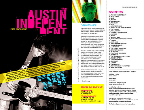
This contents page taken from "The Austin Independent" is a very modern and unique layout. The image of a guitarist has overlapping text in bright colours, layered on and positioned at different angles. This is a very effective use of design. I especially like the title as it is in a bright colour, but the font is unique with filled in letters which are slightly missed off on the last line. I also like the blue text underneath the diagonal yellow text box, which is aligned with the text box as this adds a new colour and also a new angle. The main contents page uses a plain white background, which is not as effective as the black with colours as the image page was. However, the image of the publisher has been edited  so that the man looks green and the background is stripes which give a feeling of dimension to the image. I particularly like this image as it is interesting and unique. The rest of the contents page is plain black text on a white background. I find this very uninteresting, and I feel that it spoils the overall look of the page. I think that if the black background had been used for this part with white and coloured text would have looked much better.
I would like to use some of the ideas of layering shown in this example, mainly from the part of the page which uses an image and a black background. I would also like to experiment with the colours of my images, to make them as interesting as possible, like the images on this layout.

Contents page analysis 1

This image is a contents page taken from an issue of  rock music magazine. This layout is very simple constisting of straight aligned images and text. A white background has been used, which is rather uninteresting, and plain. The text is in  two different font sizes. The smaller text is very difficult to read, however, it causes the larger text to stand out. The use of colour in this magazine is limited and uses mainly black, white and orange. The images have a distressed, vintage look to them and are not very clear. I expect the producers of this magazine were looking to achieve a vintage look for the magazine contents page. This has been successful but it is not something that I wish to reproduce for my own music magazine.

Q magazine front cover analysis

This magazine, Q, sells more copies than most other music magazines and so is a very popular choice. This magazine has a cluttered front cover, which is full of information about the issue. The colours used in  this front cover are mainly black, red and white. The title, Q, is in the top left hand corner, and is only just visible due to the overlapping image. I like the way that this image overlaps the title, but the other text such as "MADONNA" covers the image. This makes the main headline of the magazine stand out more than the title. This will help in attracting new customers, such as fans of Madonna, who would not usually purchase the magazine. The overlapping grey band "Women in music", provides a new dimension to the design, as this banner is tilted, it stands out more. However, the main title of "MADONNA" is what stands out the most. I particularly like the use of colour in this image, and the overall layout is very effective. I would like to reproduce some of the features of this design in my own magazine such as the use of the main image which overlaps but is also overlapped by other images and text.
Add Image


Thursday 15 January 2009

Circulation figures

Below is a list of magazine circulation figures for various music magazines:
Classic Fm 41,412 ABC Jan-Dec 2007 source: Haymarket
http://dezji.wordpress.com/2008/08/15/uk-music-magazine-circulation-figures-2/Classic Rock 66,632 (67,399) January-June 2008
Kerrang! 60,294 (76,937)January-June 2008
Metal Hammer 48,540 (45,809)January-June 2008
Mixmag 34,073 (35,817)January-June 2008
Mojo 106,367 (106,218 )January-June 2008
NME 56,284 (64,033)January-June 2008
113,174 (131,330)January-June 2008
Rock Sound 22,527 (23,021)January-June 2008
Terrorizer no figures (14,952)January-June 2008
The Fly 105,212 (103,051)January-June 2008
Uncut 86,925 (91,028 )January-June 2008

From the Circulation figures listed above, I can see that the magazine, Q sells the most copies in the popular music and rock music category. Classic fm circulation figures were only available for the time period listed above: Jan-Dec 2007. However, from these figures, I can see that Classic fm sells a lot less magazines than other, more rock music based magazines. This is possibly due to the age range of magazine viewers, which are mainly teenagers.

Interesting photographs

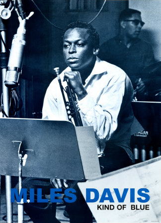
This image of Miles Davis is a famous image of the musician. I think this image is intersting as it has a blue colourwash over it, to fit with the blue text used for the title. I would like to use images like this in my magazine, showing musicians in their usual practice locations in addition to the glamorous, more staged photographs. By using the two types of photograph, it will attract more readers, and also provide a contrast to the more staged photographs. 
Because my magazine will combine Classical music and jazz, I would like to use a variety of images to fit with both of these genres. For example, Jazz images are usually less staged than classical music photographs. The contrast can be seen with this image of Miles Davis, compared with the image of Emma johnson, a classical clarinetist shown below. The image of Emma Johnson is staged, and has a more glamorous look than the photograph of Miles Davis.


2009 A year for Joseph Haydn

This year, 2009 marks the 200th anniversary of the death of Joseph Haydn. This is very topical in the classical music world at the moment. Because of this, I would like to include at least one thing within my magazine about this topic. This will not be the main article, but it will feature as a minor article in  the magazine. 
By covering this topic, the magazine will appeal to classical music lovers, and will give the impression that the magazine is up to date and covers things that are topical at the time.
Below is some information about this topic, which gives an outline to the event, and will also provide an overview of what the article could be based on.

2009 marks the 200th anniversary of the death of Joseph Haydn (1732 to 1809). With the HaydnYear 2009 the city pays tribute to Joseph Haydn who had started his career as a member of the Vienna Boys' Choir at St. Stephen's Cathedral and went on to become a celebrated composer on the city's musical stages. A comprehensive and varied programme consisting of more than 100 events - many of them at original locations - will offer a broad audience the opportunity to get to know not only Joseph Haydn, the composer, but also Joseph Haydn, the private man.http://www.wien.gv.at/english/culture/haydn/index.html

Radio 3: Composers Of The Year 2009 – 
Joseph Haydn (1732-1809)

Haydn

Most people know Joseph Haydn as Austria's great master of Classical style, and the man who taught Mozart and Beethoven. He is called by some the "Father of the Symphony" and "Father of the String Quartet".

A life-long citizen of Austria, Haydn spent much of his career as a court musician for the wealthy Hungarian Esterházy family on its remote estate. Isolated from other composers and trends in music until the latter part of his long life he was, as he put it, "forced to become original".

As the composer of some of the world's best-loved symphonies, choral music and chamber music, his fame was truly international. Haydn arrived in England on New Year's Day, 1791 – it was the first time that he'd been allowed to leave his noble masters at Esterházy, and it was Britain that he chose as his destination.

Right from the start, he enjoyed a level of fame and adulation here that was unprecedented for a composer of classical music. His presence here marked a turning point not only in musical culture, but also in his music. He died in Vienna on 31 May 1809, aged 77.


http://www.bbc.co.uk/pressoffice/pressreleases/stories/2009/01_january/13/composer4.shtml

Rolling stone magazine front cover analysis

This magazine, Rolling Stone, is a rock music magazine. i have chosen to analyze this front cover as it is very different to the other magazine covers that I have looked at. This front cover has an overall vintage look, which gives a new look to the music magazine industry. This cover used an image in sepia rather than in full colour. Behind this image is a fire image, and a white background is used. The main title "Rolling Stone" is overlapped by a pig image and a text box:"New clues to JFK's murder". This is an interesting use of design, and makes this magazine stand out amongst others. However, this is not good because the title is covered, a reader may be unsure which magazine it is they are buying. The article title "Pink Floyd" is in the same orange to the background fire image, this helps to bring the colour back, and draw attention to the background. The other article titles are written in white to bring back the white background. This is an effective use of colour, which makes this magazine cover look well co-ordinated. The text at the top of the magazine "THE NEXT WAR ON DOWNLOADING" is in a newspaper style font, which contributes to the overall vintage look of the magazine.
Overall, I think this magazine front cover is successful and unique, but personally I prefer the more sophisticated and brighter look.
Add Image

Music magazine front cover analysis 3


This front cover is taken from a music magazine which is also about fashion. By covering two areas, this magazine attracts a new audience and fills a gap in the market. For example music and fashion lovers will be able to buy this one magazine rather than two individual magazines.  I have chosen to analyze this front cover because of its interesting layout and use of colour. The main colours used in this layout are mainly pink, gold and black. This is a unique combination, which looks quite feminine but also modern. There are not too many other colours used, which makes this cover look very well colour co-ordinated. Like the Classic fm cover, the main image is used within the background, with the text over the top. I think that this use of image is a good way of using a large image on a cover, and also gives a modern and popular look. I particularly like the star images around the name "Duffy", this gives a glamorous look and also makes the cover look more exciting. In the title, the text has been altered to add a  more interesting look to the name. I like this idea of altering text, but I prefer using musical symbols to make the text look more interesting. The image and text in the top right corner "Gnarls Barkley" looks as though it has been added at the last minute, and in my opinion spoils the overall look of the magazine.
Overall, I think this is a successful magazine cover as it looks modern and unique. 

Tuesday 13 January 2009

Classic Fm Layout Review 2


John Tavener
This article is about the composer John Tavener. This article includes information of his work, interesting facts, a manuscript example of an extract from his work "The Lamb", a quotation from a performer, reviews on some recordings of his work, and other interesting information such as books and concerts.
This layout uses a watercolour style image of the composer with a lamb in a boat. This gives reference to one of his best known works, "The Lamb". Below this is a manuscript example with red circles and letters on, which relate to the text opposite titled "Defining moment". A quotation is also layered onto this image in the top right hand corner. The colours used in this article match and compliment each other well. However they are very dull and boring. I feel that a brighter colour would be more striking. Also this layout is quite boring with the images and text separated, which gives more of a text book feel than a magazine. However, this article contains a lot of information abou the composer, and would be very interesting and useful for students and teachers.

Classic Fm February 2009 review of layout

ARTICLE LAYOUT
On page 32 of the latest issue of classic fm magazine, an article titled "Seven musical wonders of the world". This page uses an interesting layout of photographs in circles combined with text, which is all layered over a faded globe image. An image of this page is shown opposite.
This layout is very effective, and is also original and eye catching. The use of circles instead on rectangles, gives the page a more modern and individual look. I like the use of colour on this page, using mainly blue, but with full colour photographs. By doing this, the images stand out from the text, and so the eye is immediately drawn to them. A brighter, more complicated background would not help the images to stand out.  However, the font used on this front cover is rather boring, and I feel a more modern font would add to the overall look of the page. I would like to use interesting layouts such as this one myself in my own magazine, but I would like to make them more modern than this one by changing the fonts and maybe adding a border or something, to add further interest. 


Analysis of a magazine front cover 2

This music magazine "SOUND ON SOUND" is a music magazine about recording music and music production, rather than the music itself. This magazine is usually read by music technology students, teachers, session musicians, producers and engineers. This magazine contains information about new music based technology such as mixers and microphones, and also a couple of articles about artists and music itself. This music magazine is more of a reference magazine rather than an easy to read informal magazine. However, this magazine is a popular choice.
This front cover has a border in the top corner, which looks more interesting than a regular title across the top, but this takes up a lot of space, which could be occupied by other information. The main title is in a box rather than being super imposed onto the image, like the Classic Fm title. The main image used on the front cover is interesting in the sense that it is not just a regular image of a violin. The photographer has made this photograph unique with the placing of the violin and also the manuscript background. 
Like the Classic Fm Magazine cover, there are pieces of information about the articles inside the magazine, which help to show the reader what's inside. Also the image of the Foo Fighters shows that this magazine is not about classical music, and so will attract two audiences as opposed to one. However, this is good as music technology is used for all genres of music.
The colours on this front cover are brighter than Classic FM, but they do not make the magazine more appealing as a whole, this magazine looks a little odd, for example, the blue background would have been better red, as this blue does not really fit with anything else on the cover. 

Analysis of a magazine front cover


The front cover shown above is taken from a previous issue of Classic Fm magazine. The colour scheme is made up of mainly white, red and black, which is a common colour scheme for this magazine. The header "Free CD! The UK's favourite Classical music magazine" is used on the front cover of every issue. This is effective as readers are attracted to free gifts, so when this magazine is placed in a rack in a news agent, this headline will be seen clearly. Also the free CD is glued to the front cover (shown in this example). I like the use of an image with text and other small images over it. I think that this is an interesting and effective use of the image. Also the front cover is not too busy, and the eye is drawn to the main picture and the free CD. The use of colour in this front cover is unimaginative and not very appealing, Although it looks sophisticated, it will not do very well in attracting the younger audience. I think that to attract a younger audience, brighter colours should be used. There is a lot of information given on the front cover such as "100 CDs, books, DVDs rated", and "Debut CD Interview" with Kate Royal, "Fiddler on the surf", and "New season preview". This gives the audience an insight into the contents of the magazine. Also by including a variety of different article information on the cover, there appears to be something for every reader. The images used are of good quality, and the magazine looks very professional and sophisticated.

Saturday 10 January 2009

Ideas for the magazine article

The Main double page spread article will cover one main area of a classical music magazine. Here are my ideas for my main article:
  • A report on a new and upcoming star
  • An overview of a composers career with information about their music and recordings of their music.
  • A full review of a CD or downloadable recording, that has reached the title of  "Recording of the month", or  "Editor's favourite this month" or a similar title
  • A review and information on one particular work by a single composer, with a detailed commentary on the composer's possible intentions for the piece.
  • A review of a performers life, with details of their recordings, and their passion for their instrument or voice. 
My article will include relevant information to the topic, and also possibly music examples (excerpts from a score or piece of music), in addition to photographs. I would like to include photographs of performers, and also instruments and composers, however composers' normally only have paintings of them, but these are what is normally used in other classical music magazines such as BBC music magazine.

Title of Music Magazine

I have thought of a few different names for my Music magazine which are as follows:
  • filarmonico- an italian adjective meaning 'music loving'
  • The Score
  • The Stave
  • Melody
  • Maestro
  • Passionato
I have decided on the name 'The Score'. I have chosen this because it applies to all instruments and all voices. All music written has a score, and so it covers all areas of music. Also by using this name, which is a predominantly classical term, the audience will be aware that the magazine is about classical music. In addition, 'The Score' is not too long, and will be easy to remember than a longer title such as 'Filarmonico'.
When producing a logo for my magazine, I will be able to add musical symbols to the text in a similar way to the classic fm title, using a forte (f) marking instead of a regular f. This will also alert the reader straight away that this is a Music Magazine.

Friday 9 January 2009

Classic FM Magazine February 2009

Here are images of some of the layouts in the current issue of Classic Fm and the front cover of BBC music magazine